NEWS FLASH
—hot design trends to watch for in 2022.
So, what’s in store?
Are pinky pastels a no-no? Is minimalism finally over? Can someone please turn up the noise on those tones?
If experimentation and rule-breaking are your things, then you’re in for a treat. But don’t worry, if you’re camp traditional, some golden oldies are returning.
And for those stuck in the middle—plenty of juxtaposition to keep everyone happy.
So, sit back, relax and let us take you on a tour of the coolest, most fun, knock your socks off 2022 design trends.
Exciting design trends coming in 2022
#1 Muted tones vs candy colours
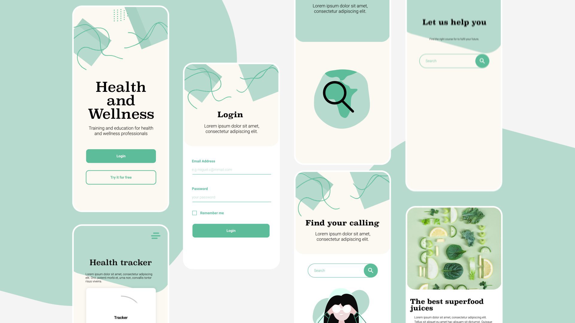
Not a friendship you’d expect. But, hey, we’re in the roaring ’20s, and anything goes.
Muted tones are subtle, easy on the retina, and perfect for conjuring feelings of homeliness and comfort. It’s a bit like viewing the colour spectrum through a mist of soft white fluffy clouds.
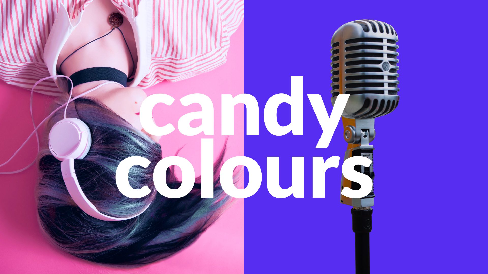
Zip over to the other side of the palette continuum—candy colours are vibrant, pop-in-your-face, and bold as brass. These colours are on caffeine whilst hanging out in Disneyland. And, yes, they’re super fun.
Also, these guys play together rather nicely. So, don’t be afraid to mix and match. Muted tones sprinkled with candy-cane colour bursts can really make a statement.
Surprisingly, they provide an excellent foil for each other. Balancing the brash with the insipid produces a more powerful, engaging experience.
#2 Design mash-ups of 2D & 3D
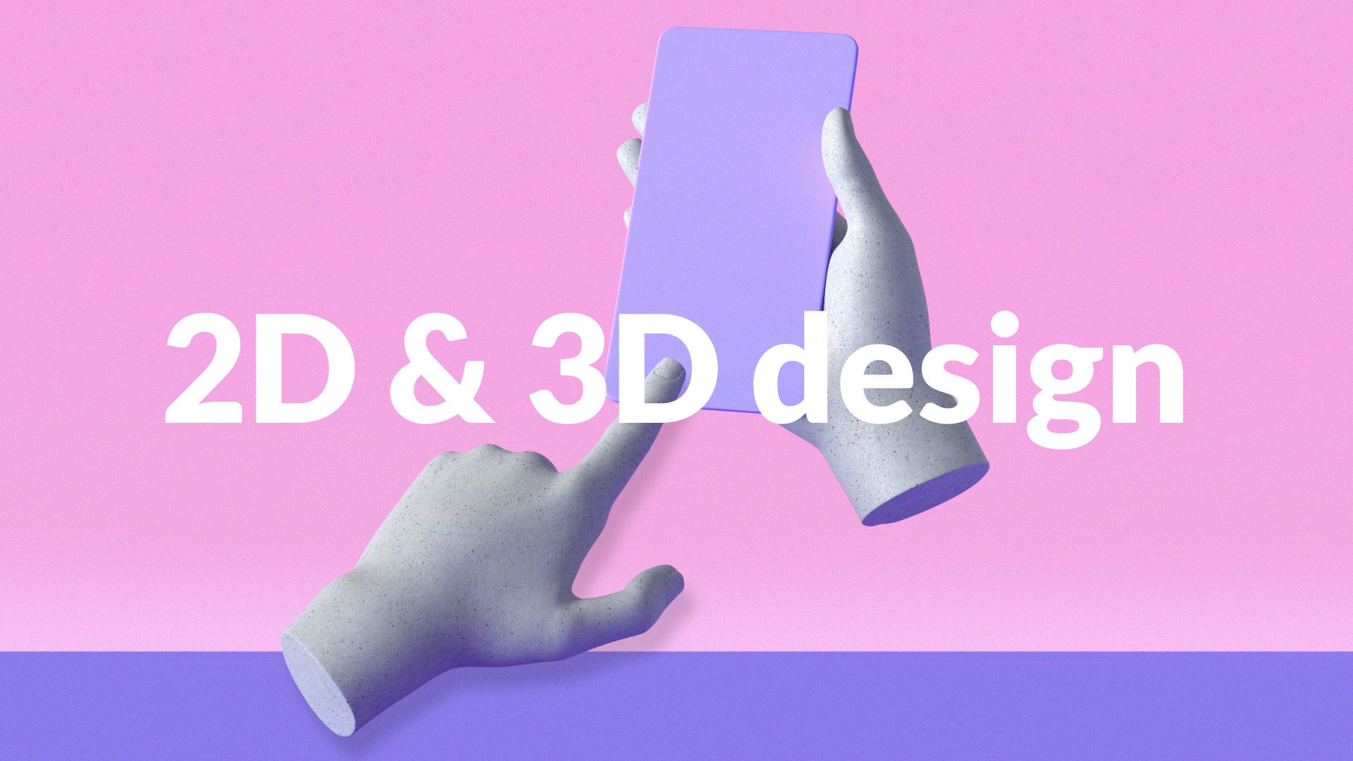
Picture the difference between these two—a circle and a sphere or a pyramid and a triangle.
One is flat, passive, static—you can only engage with it from one perspective— 2D.
While the other is dynamic, has multiple perspectives, feels a bit magic—3D.
Now, 3D design is everywhere. And, its popularity is no surprise. It enables you to take something static and elevate it into a whole new sphere of interaction.
What’s more, designers are now mashing 3D together with 2D design. Artists are making 3D designs in a flat 2D way and using the two alongside each other to create a unique effect.
3D designs add depth and dimension which arguably hold your attention for longer. It’s great for storytelling or explaining something quickly. It also adds personality to a brand and says much more than a static image can.
#3 Big typography & contemporary serif fonts
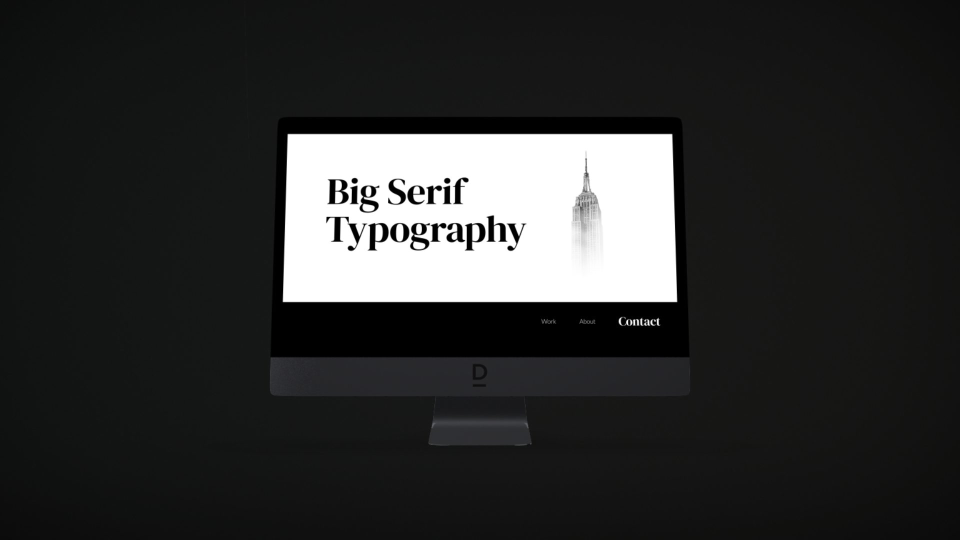
Wanna make some noise?
You’ll need a visual loudspeaker. Web design loves BIG typography right now. So if you want your voice to soar above the hubbub, this is a super quick and effective tool. There’s a lot of experimentation happening in design, and typography is no different. Designers are taking classic serif fonts and giving them a 21st-century makeover. Think flourishes and ligatures (ways to connect letters)—these are injecting a zingy new twist to tired old fonts, making them exciting and relevant, again.#4 Anti-Design
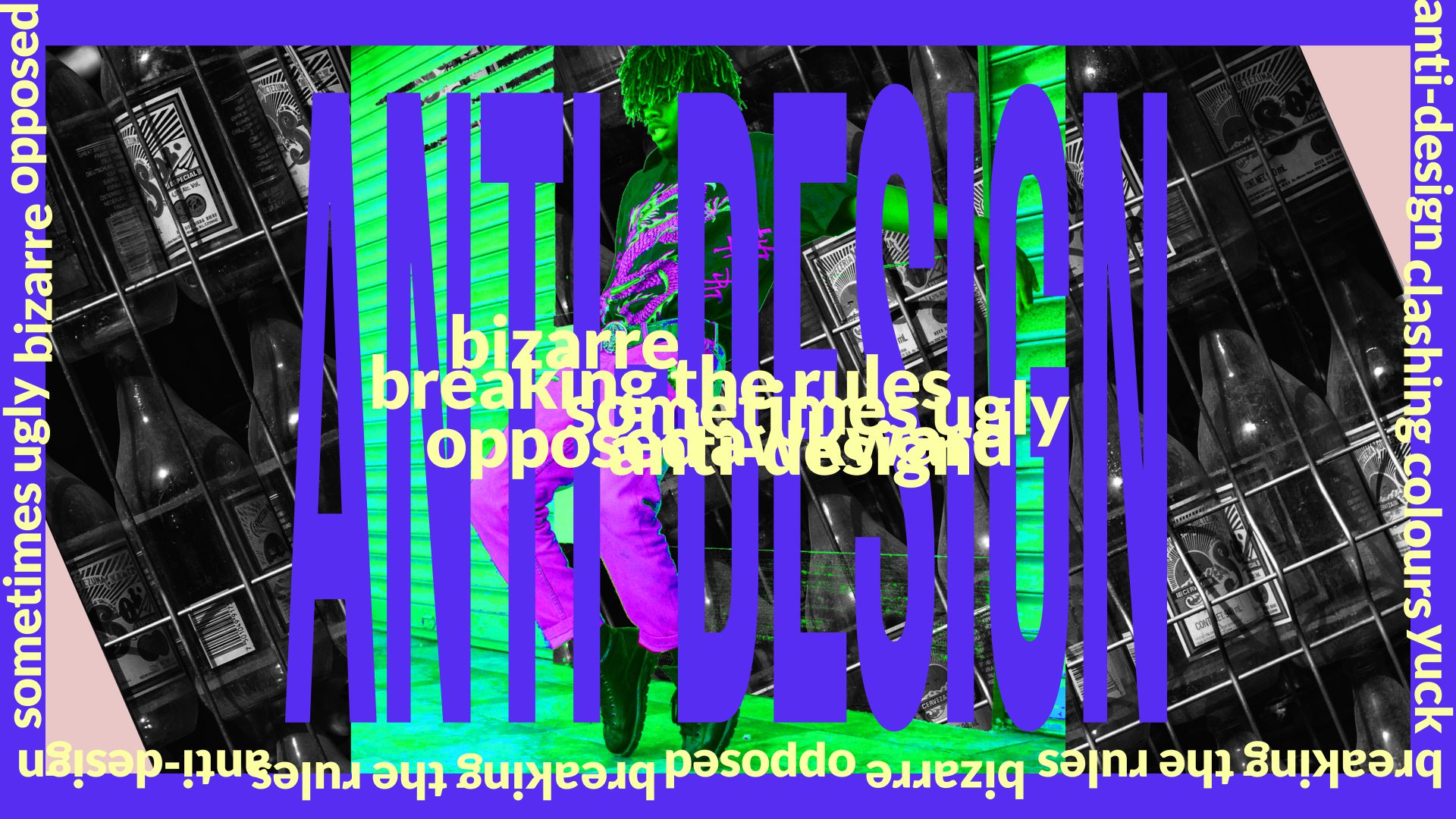
Think David Carsen—king of radical, non-conformist, experimental design.
However, anti-design today is less grunge (although that’s making a big comeback, too) and more punk. It’s all about garish clashing colours, mashed-up illegible content and challenging exaggerated typography. The messaging is about disruption and turning things upside down (remember the don’t buy this product ads?)
Not for everyone, but it’s important to remember anti-design takes skill and confidence. At its heart, it’s a movement that’s not simply about breaking the rules for the fun of it, but rather it’s re-imagining design for a new audience and moment in time. Sure, this makes anti-design an exciting trend and one to watch as it moves out of being niche and starts to infiltrate the mainstream.
#5 Maximalism vs Minimalism
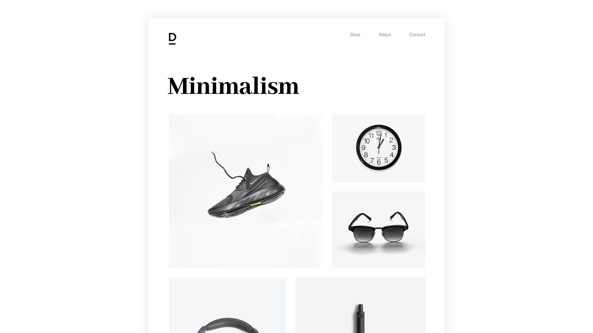
Minimalism has been the trend du jour for over a decade. So if you haven’t Marie Kondo’ed your life, it begs the question, what stone have you been living under? But, let’s not digress.
Minimalism remains the go-to design style of choice. And, there’s a good reason for this—because it works. But, this means it has to be done well (hint: Apple).
The less-is-more mantra underpins much of contemporary design. Uncluttered, simple messaging coupled with calming colours is effective and popular—it emotionally connects with the audience.
By making space a desirable asset, minimalist designs feel relaxing and soothing—they’re aspirational whilst also feeling attainable.
But the supreme reign of minimalism was never going to last forever. So here comes the counter-attack—maximalism— white empty space is its enemy.
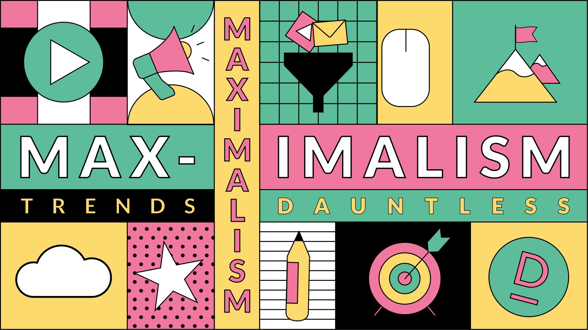
Forget greyed out shades. It’s about bold and loud, and oh boy, it wants your attention, now, now, now.
The designs feel cramped and cluttered, packed full of mixed media images and text, all vying for your attention.
Hang on, this sounds like anti-design?
Yep, but it’s not. Unlike Anti-Design, which feels uncomfortable, maximalism brings harmony and unity through the imagery and the colours.
So, when you engage with it, it’s pleasing, exciting and alluring (not brash and subversive) like anti-design.
Maximalism says fun. It takes your hand and says, we’re going on an adventure, and it’s going to be amazing.
Final thoughts
What design trend is setting your world on fire right now?
