All disciplines have rules
—and design is no different.
If you want to create compelling, succinct and meaningful designs, you must understand the fundamentals.
However, unlike more prescriptive approaches, design principles are more intuitive and fluid.
You might not even realise you’re using the principles because they’ve become intrinsic—you’re simply doing what feels ‘right.’
So, adhering to them is less a tick-boxing exercise and more a respectful nod to good practice.
In this way, design principles guide you to move beyond aesthetics to create impressive and impactful visual representations that truly connect with their intended audience.
Why do you need design principles?
When it comes to design, take the road most travelled.
Why walk an unmarked path when those before you have done all the heavy lifting—right? After all, tried and tested conventions work for a good reason.
That’s what design principles are—they’re your markers—steering you towards your destination.
Fancy metaphors aside, design principles exist for a reason—because they work.
Good design moves beyond how attractive something appears into the realm of meaning and audience action. To this end, design principles give you the tools to tell a story or communicate a specific message or a purpose—to a chosen audience and instigate a desired response or reaction. Such as starting or stopping scrolling or clicking or unclicking a button.
Advancements in understanding human behaviour and psychology have also massively influenced design evolution.
For example, design principles use the laws of human perception, also known as the Gestalt Principle, which describes how humans recognise and respond to objects and patterns, and assimilate complex visual information.
As a result, design principles act as an artistic and psychological lens to steer and filter your design thinking and decision-making to deliver an optimised user experience.
What are the top 10 design principles and how do they improve the user experience?
1. Hierarchy
Humans like order. So, what happens when you look at a website? First, your brain scans the page, hunting for patterns, connections or configurations.
Employing hierarchy empowers your viewer to connect with your message or purpose far more powerfully. In other words, you’re saying this is really important or look here first.
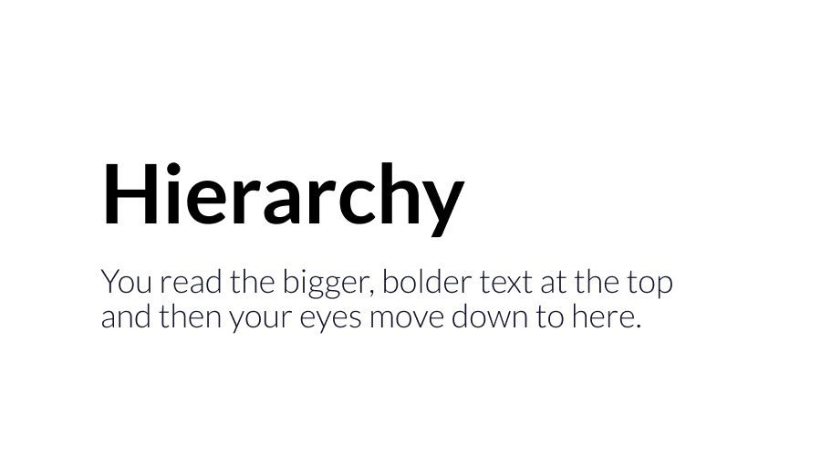
There are heaps of ways to prioritise your messaging throughout your design. For example, you can use titles and headings to prioritise text or position elements to align with human eye-movement patterns.
As a result, the design will flow far more intuitively by mirroring the viewers’ behaviours. And you can expect improved readability together with greater clarity of the purpose between the elements and the messaging.
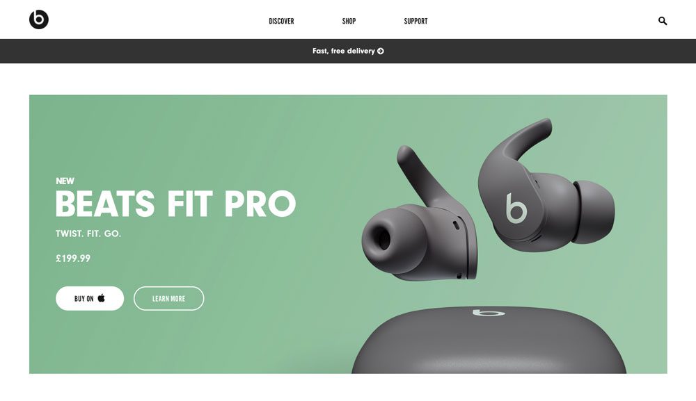
For example, Beats by Dr. Dre is a masterclass in using hierarchy to deliver impact. When looking at the web page, what do you see first? Your eyes are immediately drawn to read Beats Fit Pro—it’s unmissable. Next, the follow-on text below (which is smaller) provides the all important detail. But the priority for the audience is the product, so image + product name comes first. Only then comes the price and then the CTA button.
2. Contrast
Black writing on a white background, or large text with small. Contrast is evident through the colour palette, shape size, motion patterns and element orientation.

Make contrast your go-to tool for improving the visibility of different elements by making them stand out against each other.
In applying it you remove any distraction or ambiguity for your audience. In this way, you’re saying, look over here—there’s something that requires action.
For example, contrast is instrumental in informing your audience an action is required. For instance, it tells them they need to read something or press a button.

Contrast used correctly looks and feels natural. Let’s look at Netflix. What household isn’t familiar with their sign-in page? Here the contrast is conveyed through a dark, cinematic background overlaid with bright white text for the key messages and bold red for the CTA buttons. You instinctually know what the purpose of this page is, who it belongs to (clear branding) and what you need to do.
3. Proximity
If you want to tell a story, you need to understand the proximity principle. It refers to the space between elements, which identifies for the viewer whether or not different parts and components have a relationship.
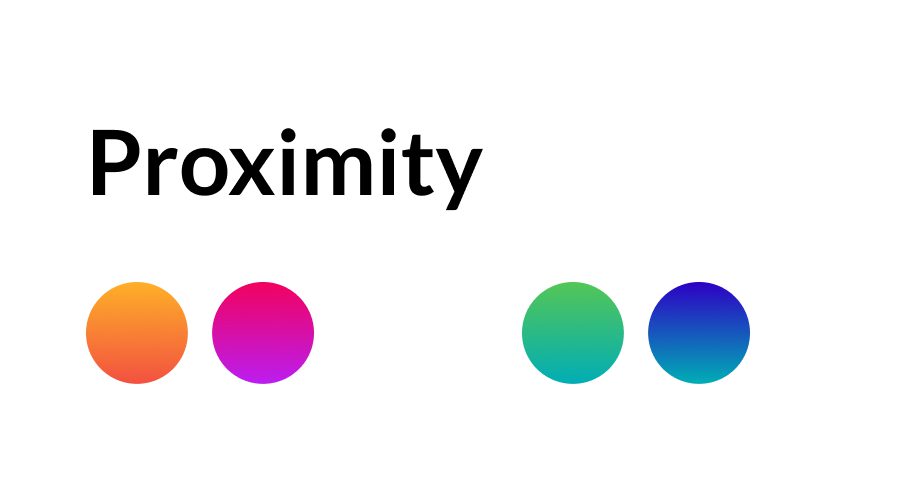
This means less clutter and visual noise with a logical, clearly defined messaging or story hierarchy.
Needless to say, websites must battle for visitors’ attention in today’s competitive digital sphere. For instance, the average person spends 54 seconds on a web page. So, if you present your audience with an easy-to-scan webpage, they’re far more likely to stick around.
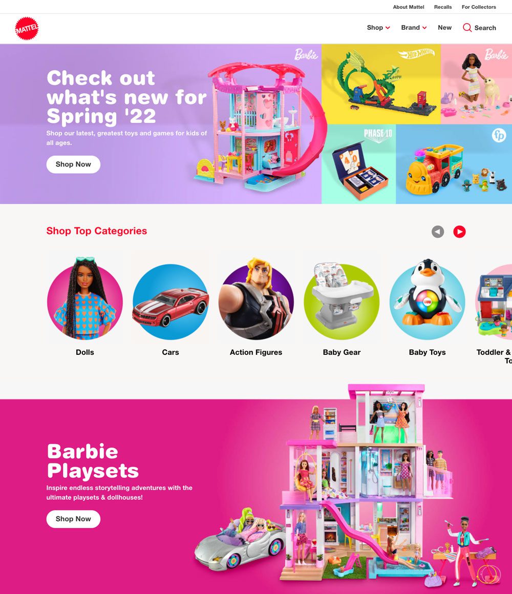
When it comes to the world of kids’ toys, having plenty of choice matters. So, how do you display your range of products without overwhelming the visitor? Check out Mattel, the leading global toy company. Mattel helps visitors find what they’re looking for immediately by using proximity and unity to highlight their product category pages. Consequently, by having circles grouped together it’s clear they belong in the same section. The result is a seamless user journey.
4. Unity
What is the goal of your design? How do you want your viewer to feel or act?
Unity is how you answer these questions—it’s the method you use to align visual and conceptual meaning into your design.
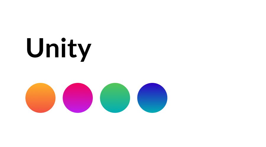
Like proximity, it involves grouping elements together to indicate they’re related. But, working at a deeper visual level—unity also satisfies the feeling of knowing things belong together.
For instance, what’s going to convey your brand message more effectively?
A consistent unified web page using complementary tones and clear style? Or one with scattered information, conflicting colours and inconsistent font throughout.
Of course, the former as mess doesn’t communicate confidence. And making your audience work hard at deciphering your messaging will leave them feeling disengaged and quickly hopping away.
5. Emphasis
Do you want your CTA button to stand out? Or you’ve got some ancillary information that needs to be included without disturbing the overall design flow or narrative?
Emphasis is how you show whether something is important or not. In other words, it means giving some elements greater significance over others.
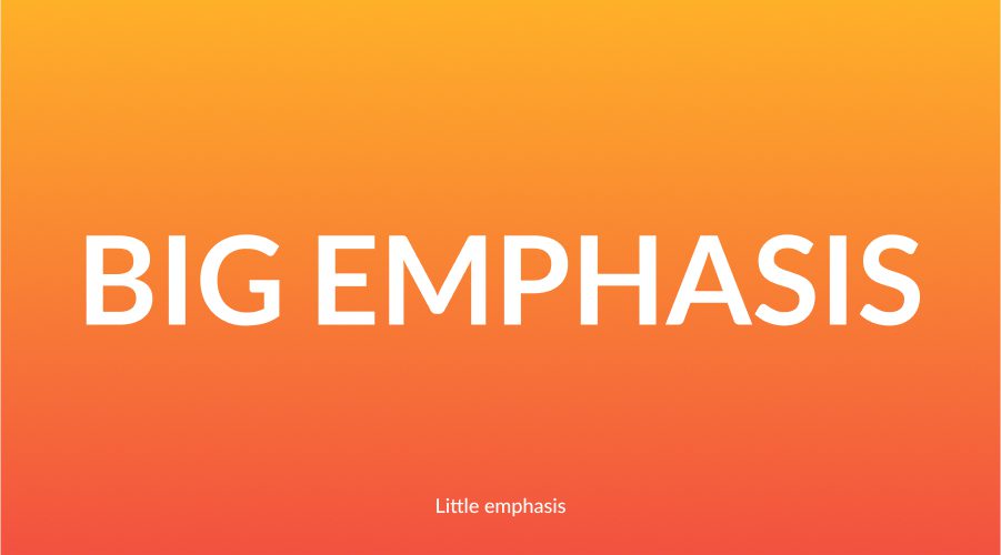
For example, look at how company Terms and Conditions are displayed. You’ll notice that they’re always written in small font and positioned at the bottom of the page. This because they’re deemed lower on the importance scale than your brand or message but still need to be there.
And, the viewer won’t get confused about what to do or where to look first. Consequently, making their interaction intuitive, easy and meaningful.
6. White space
Don’t fear white space, nor underestimate its role in creating a seamless user experience. Resist the temptation to clutter your designs to your message across.

White space allows for breathing room and helps steer the viewer where look or how to feel.
Using white space improves readability, creates a visual hierarchy and adds quality and elegance to your designs.
7. Balance
If you look at a specific design or image, you can immediately tell if it’s lopsided or if the composition is off-kilter.
More to the point, it’s visually off-putting or challenging to engage with scattered elements. It feels wrong because our brains seek meaning in symmetry and patterns.
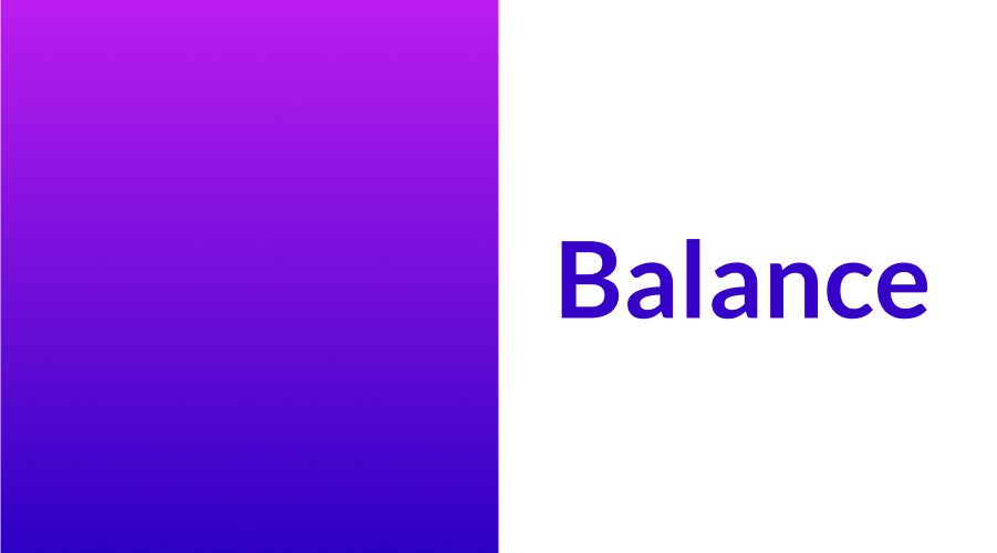
So, what’s so great about symmetry? Let’s look at human psychology again. As humans, we have an aesthetic preference for symmetrical objects and faces.
By ensuring all your design elements—like size, shape and colour, and the visual direction of their location is balanced, you imbue your audience with an overall pleasant feeling, which equals greater engagement and connection with your design purpose.
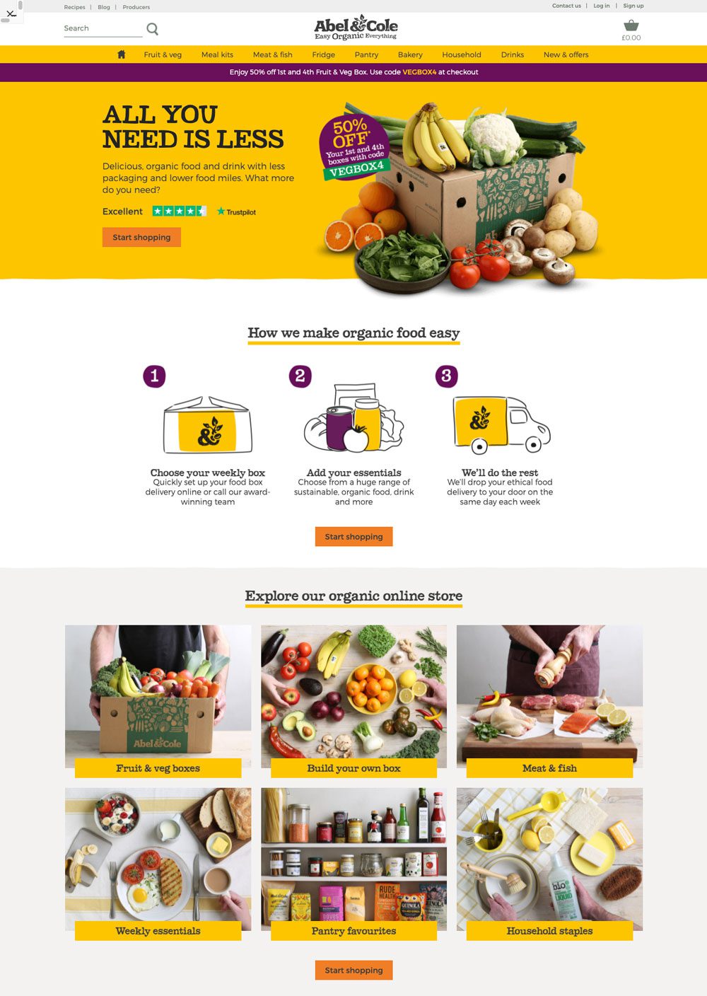
How can you tell if your design is balanced? For example, Abel & Cole, the UK’s original organic fruit and veg box delivery company, has a seamless, balanced web design—perfect for showcasing their delicious products. Firstly, the hero section contains both text and image, with the two parts each taking up equal space and presence. Secondly, three illustrated icons create a transition to the final structured image grid. When you view the page, it flows and feels natural and easy to read and is engaging.
8. Variety
There’s a fine line between visually stimulating and engaging to chaotic, repetitive and boring. To break up the monotony of a composition, insert disruptions such as alternative textures, unpredictable patterns or different line lengths to differentiate sections and messaging hierarchy.
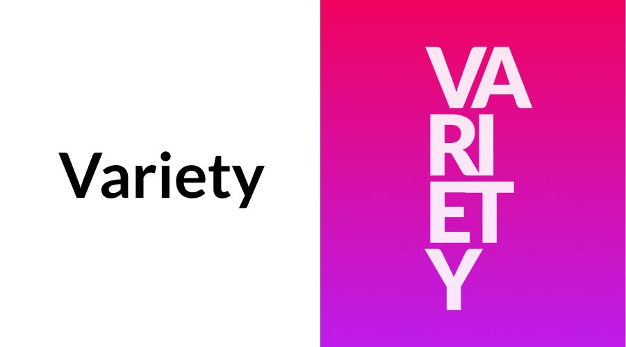
Employing difference between elements ignites excitement and avoids monotony. It keeps the viewer alert and interested. Variety is another critical tool in visual storytelling and ensuring the design flows and achieves its purpose.
9. Movement
Okay, so you’ve got contrast, balance and variety—great.
But something feels wrong. Maybe your eye is momentarily distracted, or you feel unsettled looking at the design.
What your design needs is movement. Think of it as the bow to your violin strings, bringing harmony and rhythm to your design.
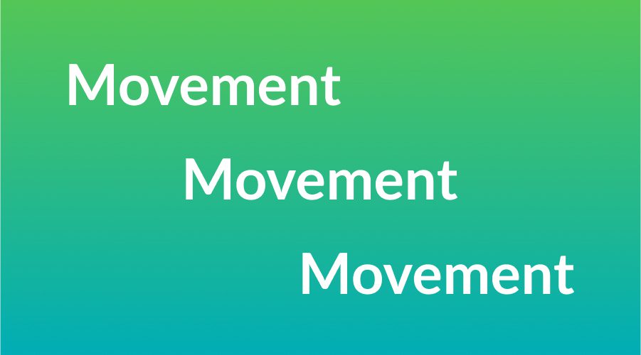
Applying movement principles ensures your designs carry a seamless visual flow. You can take your audience on a journey with a beginning, a middle and an end. The result is a satisfying sense of completion for the user experience.
Put another way, movement is the transition between the different elements. So, if something appears jarring—maybe the title font is too large, or an object is placed at a wrong angle—you remedy it by introducing a visual cadence.
For the untrained eye, you might not notice these glitches at first. But, your audience will perceive them as a disrupted experience. To counter this, use movement to strengthen your connection with the viewer and make a more impactful impression.
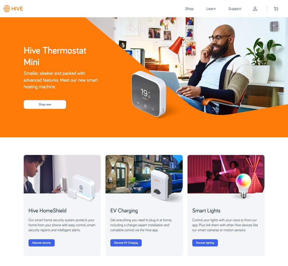
For example, the UK’s award-winning smart home provider, Hive, utilises movement on its website to create an easy-to-read experience. When you view the hero image on the landing page, you immediately see an orange shape across the bottom and side of the picture. The form encourages your eye to follow it through a seamlessly transition from the image to the text—like when reading a book.
10. Simplicity
How do you shift down gears in design?
Okay, so you want to avoid shouting your audience while still making a lasting impression. What do you need to do?
Consider this—the power of all design is found in its ability to communicate a message clearly and forthrightly.
To this end, simplicity is how you remove unnecessary messaging, dissolve ambiguity and strip your design to its primary purpose. You accomplish this through a process of iteration, recalibration and stripping back the superfluous and fluffy to showcase a strengthened, more impactful messaging.
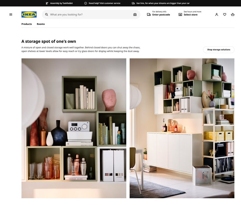
IKEA, the Swedish DIY furniture goliath, has built its entire brand around the concept of simplicity. So, its website is no exception. The focus of each page is the product. Additional information like description copy and CTA’s are designed to have a clear but subtle presence. So, they don’t detract from the page’s primary purpose, which is to showcase the IKEA lifestyle.
Before you go…
What’s your go-to design philosophy?
“Design can be art. Design can be aesthetics. Design is so simple that’s why it is so complicated.” Paul Rand American graphic designer, best know for creating corporate logos for IBM, ABC and UPS.
At Dauntless, we believe an excellent user experience requires relentless creativity.
Ready to start a project—let’s talk.
